Suzanne Collins Website Redesign
Suzanne Collins is an American author and screenwriter, famously known for her best-selling series, The Hunger Games. She has worked from children's TV shows to young adult novels throughout her lifetime. As an author with several books under her belt, she needs a website that displays her work and keeps her audience informed of any upcoming news regarding her and her works. Her current website is a reflection of that, however, it is unintuitive and disorganized for the average visitor.
In a collaboration with a team of 4, we identified, analyzed, and resolved the underlying pain points that a user would have through a detailed process of user research, persona development, content and heuristic evaluations, information architecture, user testing, and data analysis. For the redesign of the website, we all, individually, wireframed our own redesigns based on findings.
NOTE: Skip to the end for low-fidelity and high-fidelity wireframes of the redesigned website.
User Research & Personas
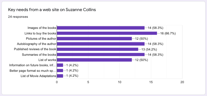
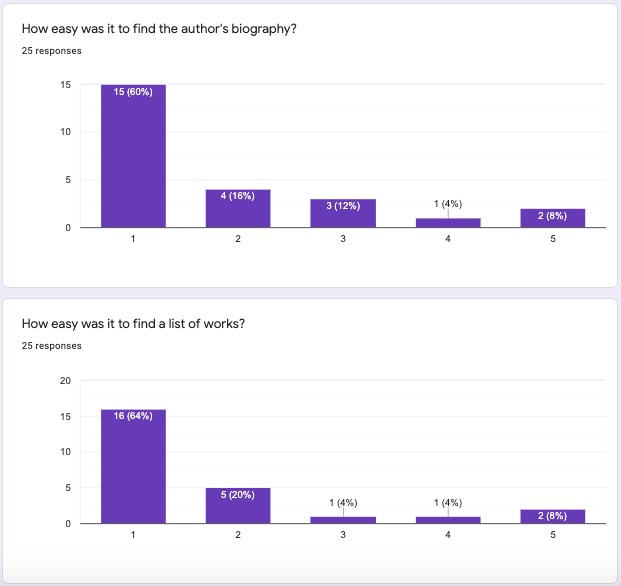
A survey was sent out to gauge the demographics of the target audience and what their needs were when visiting an author's website. They were also asked to rate the difficulty of performing specific tasks on the website and to provide any website feedback as an indication of what pain points the user may have with the current website.
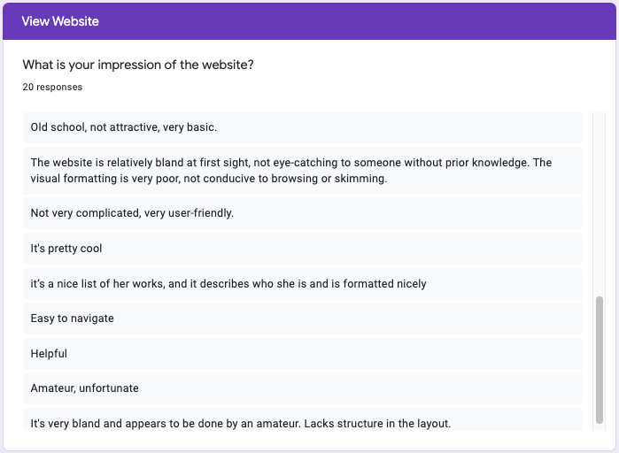
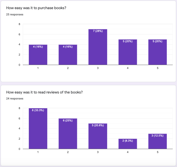
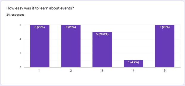
Through the survey, it was revealed that a majority of the responses felt that the visual design of the website was lacking and that it was disorganized. Despite that, most felt it was simple to navigate through the website and that it had the information they need from the author. Out of all the tasks, purchasing books, finding book reviews, and learning about events had the largest number of users choosing 3-5 as the level of difficulty in accomplishing on a rating scale of 1-5 — 1 being very easy and 5 being very hard.
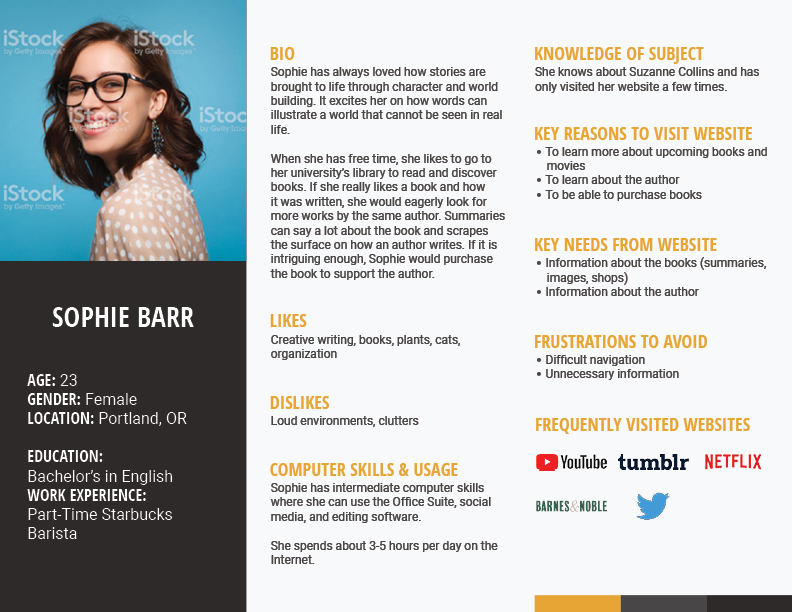
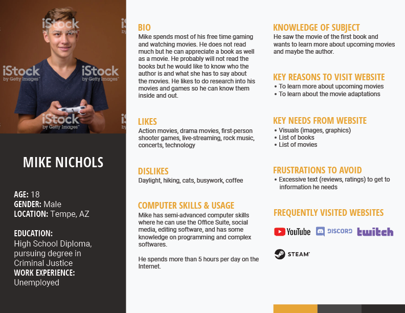
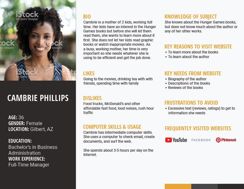
Based on the research gathered, personas were developed to provide a general idea of what the average visitor would be like.
Content & Heuristic Evaluations
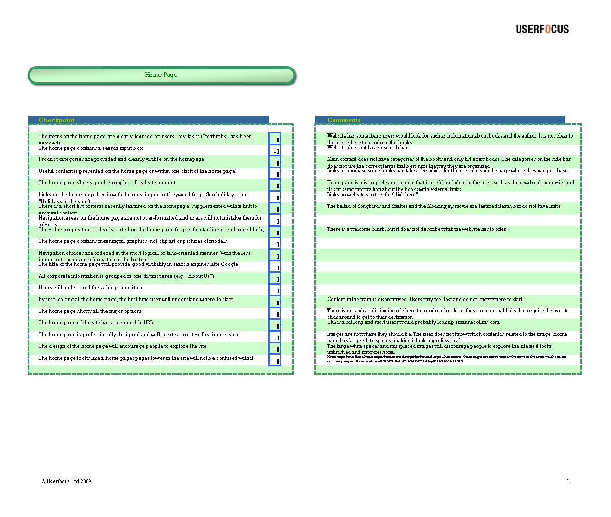
Each team member conducted their own evaluations of the website based off of usability guidelines. A rating was provided to each usability statement — -1 if it does not comply, 0 if it partially complies, 1 if it complies, and blank if it is irrelevant.
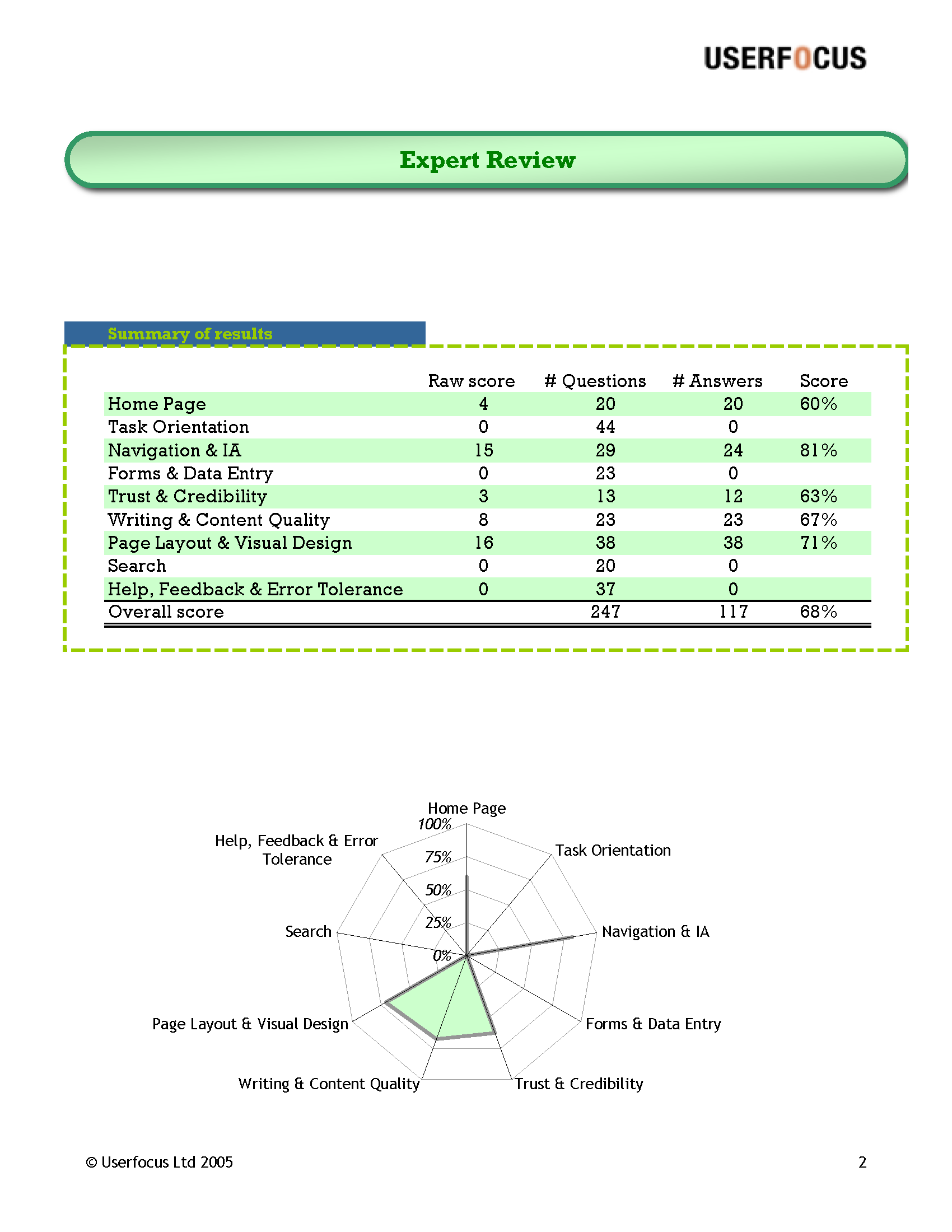
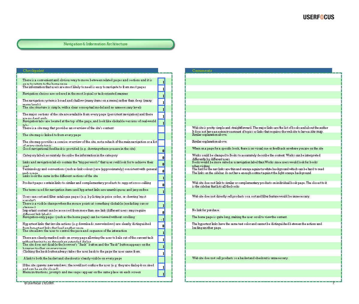
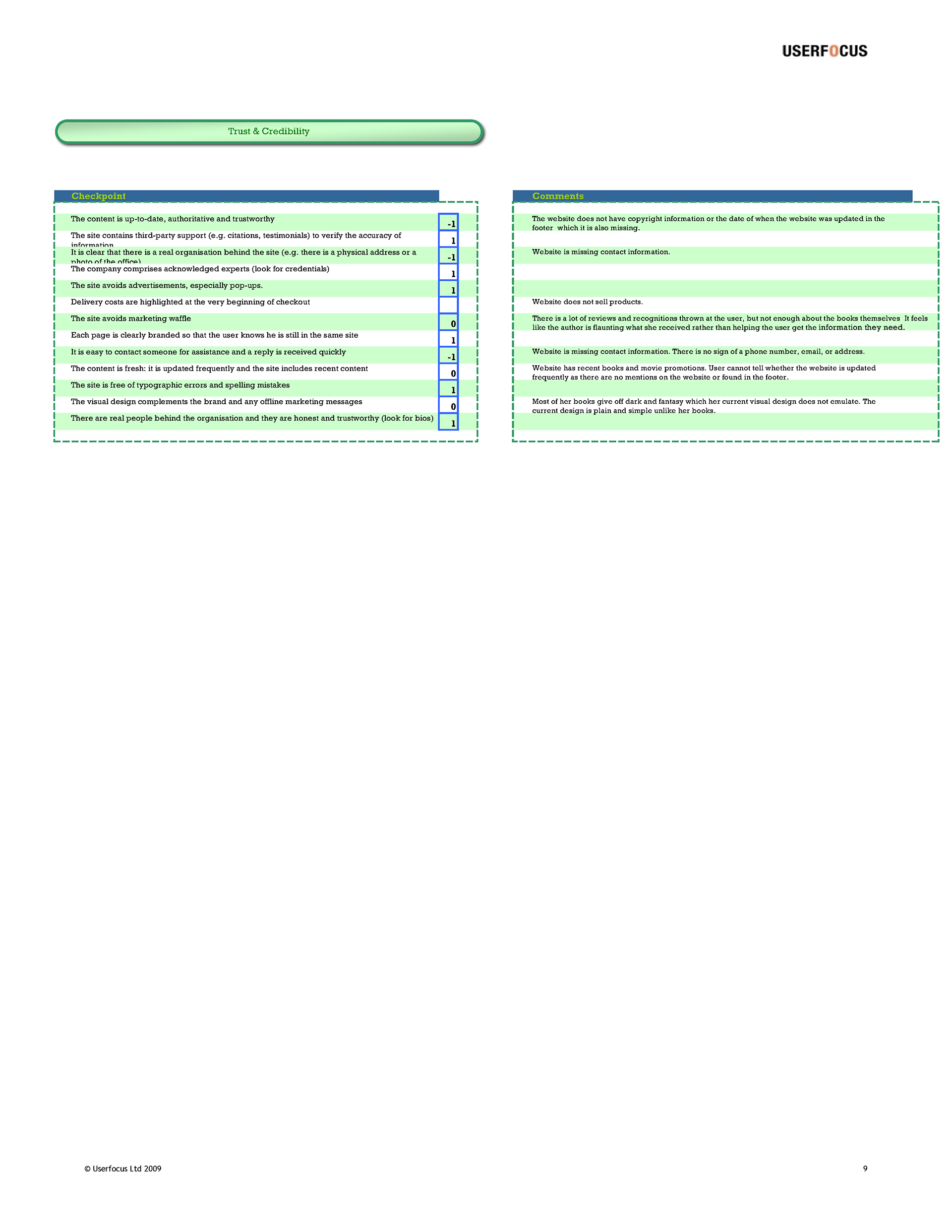
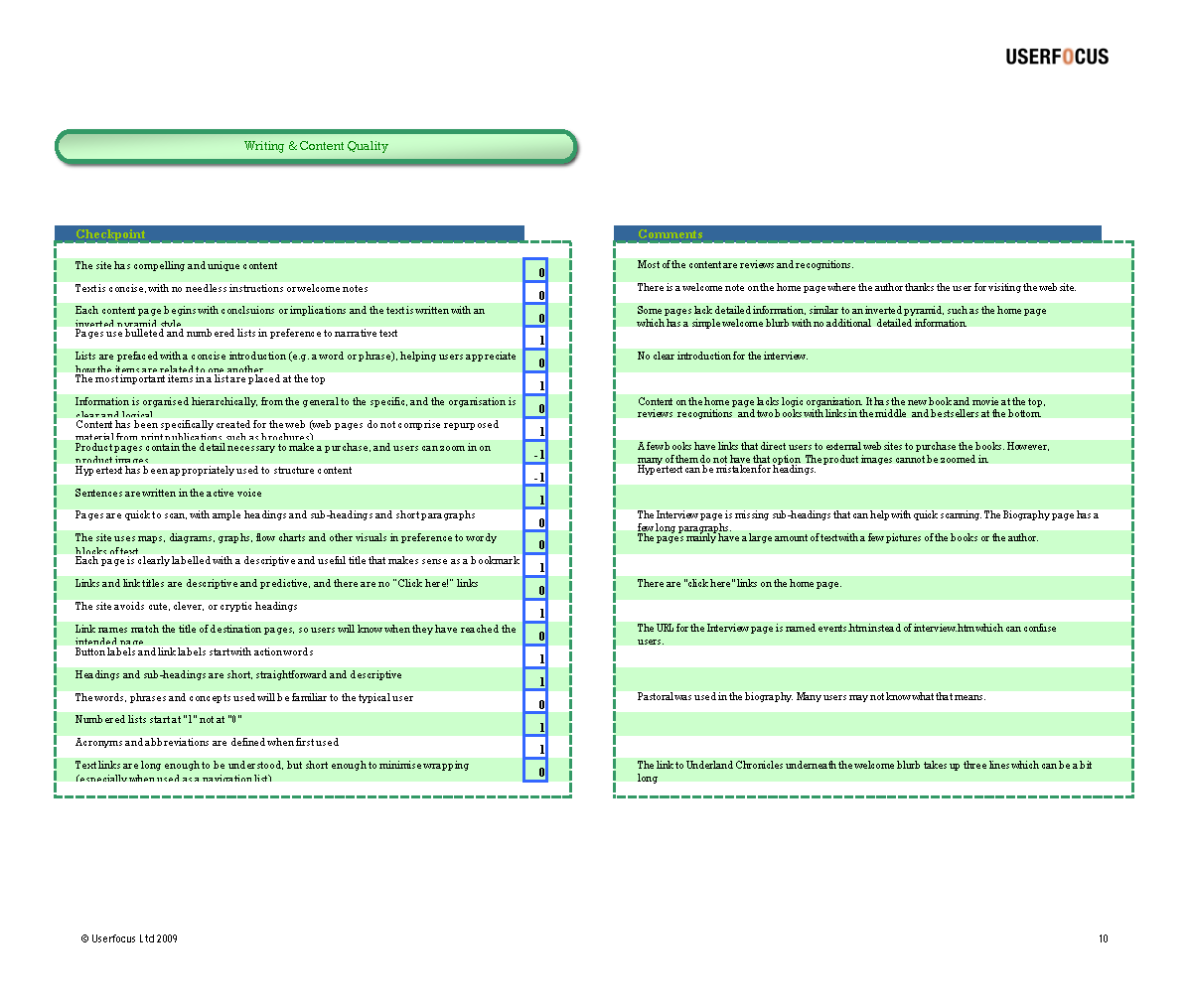
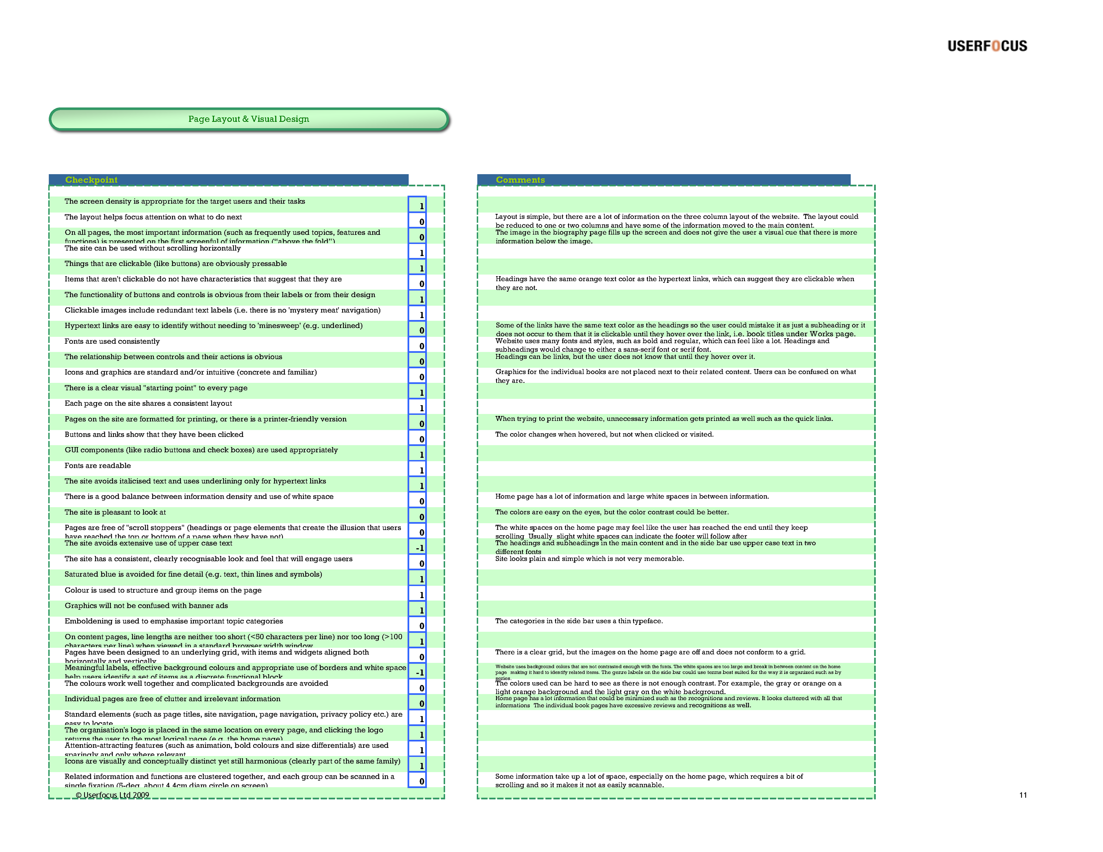
As a team, we went over the evaluations to see any overlap or differences in ratings. If there were differences, justifications were given to provide more insight on why that rating was given. This helped clear out any confusions any members had regarding the statements and provided helpful perspectives. Solutions were developed to combat the issues that were non-compliant.
Based on the user research and evaluations, the major pain points were:
• No clear structure or organization with irrelevant content. Has excessive amounts of reviews and recognitions throughout the website. Content is not easily scannable.
• Poorly labeled and unintuitive terminology to describe the content, i.e. Books is more intuitive than Works since users go on the website to check out the author's books.
• Missing information, visual cues, and has broken links. Lacks information on movie adaptions, upcoming books, and where to purchase books.
• Visual design is unprofessional and does not properly portray the author and her books. Images are not next to the content related to them and there are large amounts of white space on the Home page. Empty, unnecessary side bars on inner pages. Poor color contrast, especially text on background.
• No visual hierarchy. Headings/subheadings and links can be mistaken for one or the other by the visual indications such as color. There are several fonts and styles being used throughout the website. Sans-serif and serif fonts are used interchangeably with headings and subheadings.
• Lack of credibility. There is no contact information or footer to let users know the website is updated and trustworthy.
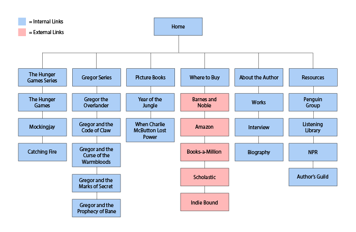
Information Architecture & Site Map
Through a card sorting activity, we gathered all the links on the website and sent the activity to 7 participants who previously answered the user research survey and would later be a part of the user testing sessions. Their task was to sort similar links together and name the categories for each group.
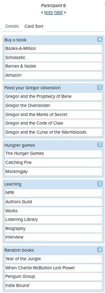
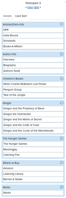
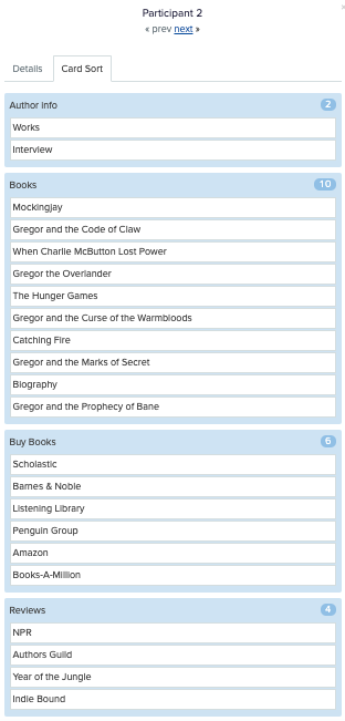
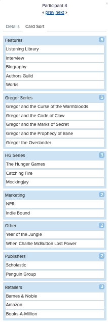
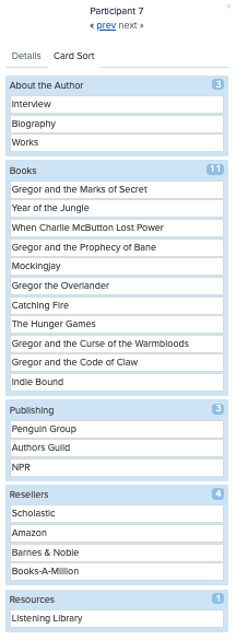
From there, we found overlaps of similar category names which were kept in the final category lineup. For the outliers that were similar, but not exactly the same, we decided to name the category that best suited the links and what the users were trying to accomplish based on the general pattern of the data gathered. For instance, there were users who named a select group of links as Resellers or Retailers and as a result, we decided on Retailers.
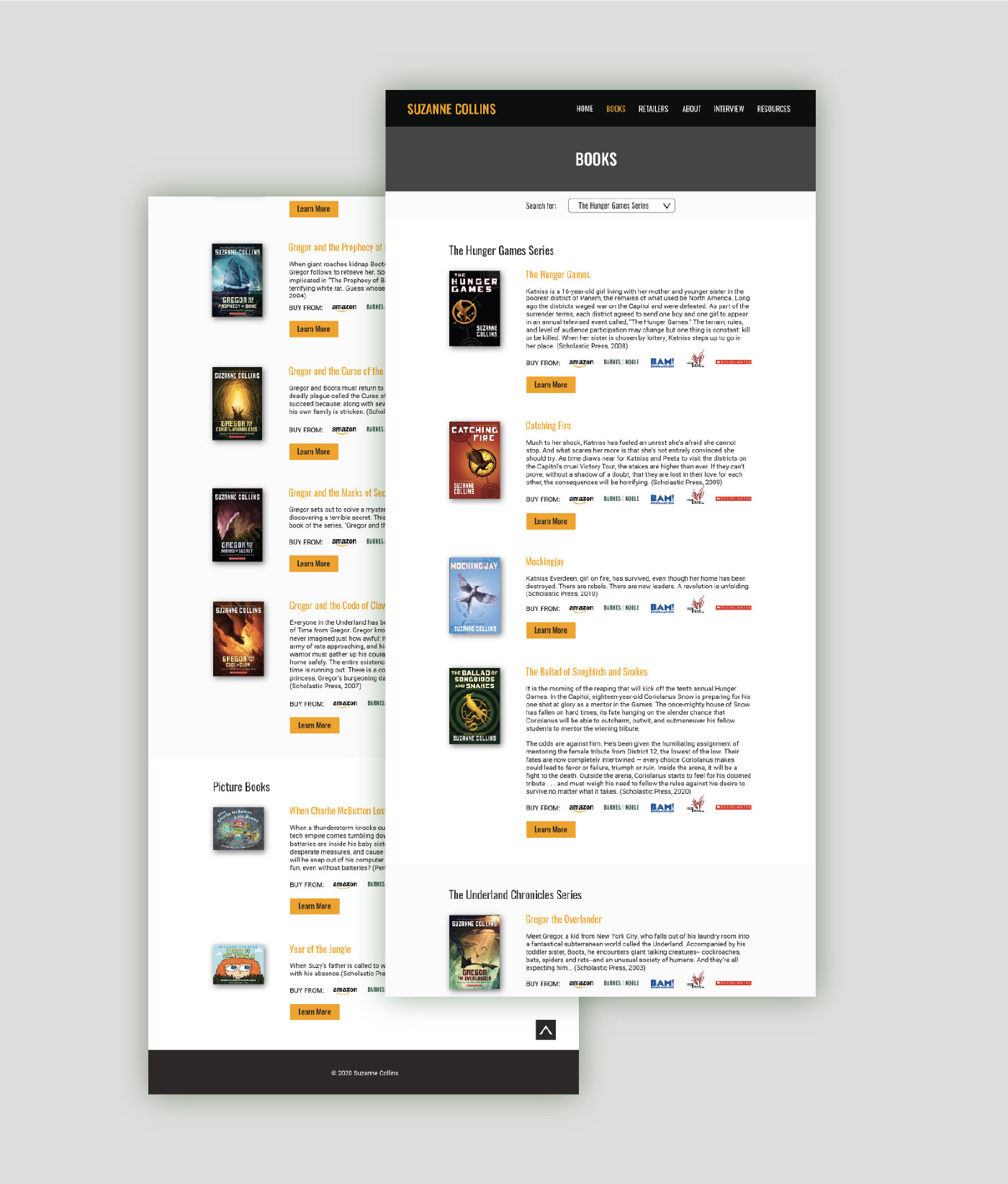
The final categories that the team decided upon were The Hunger Game Series, Gregor Series, Picture Books, Where to Buy, About the Author, and Resources. Once finalized, a site map was created to display the structure of the website.
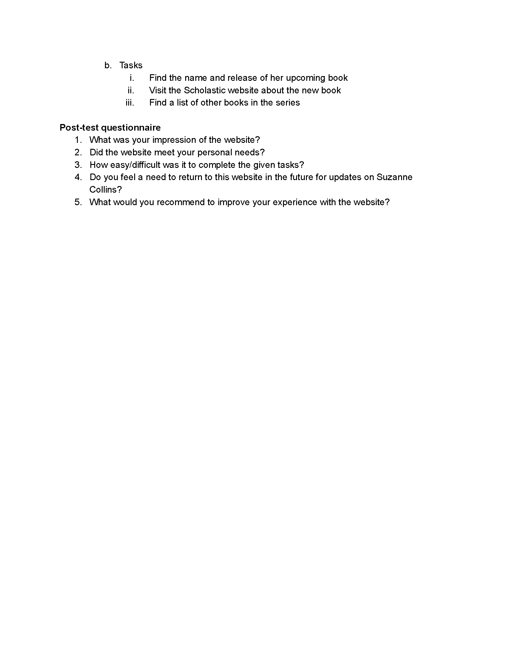
User Testing Materials & User Testing Sessions
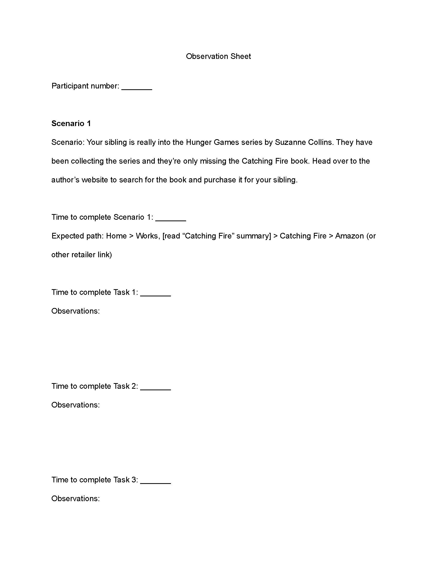
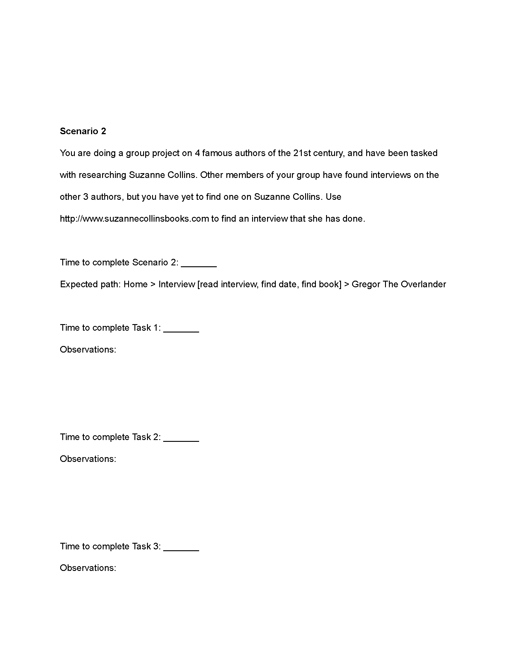
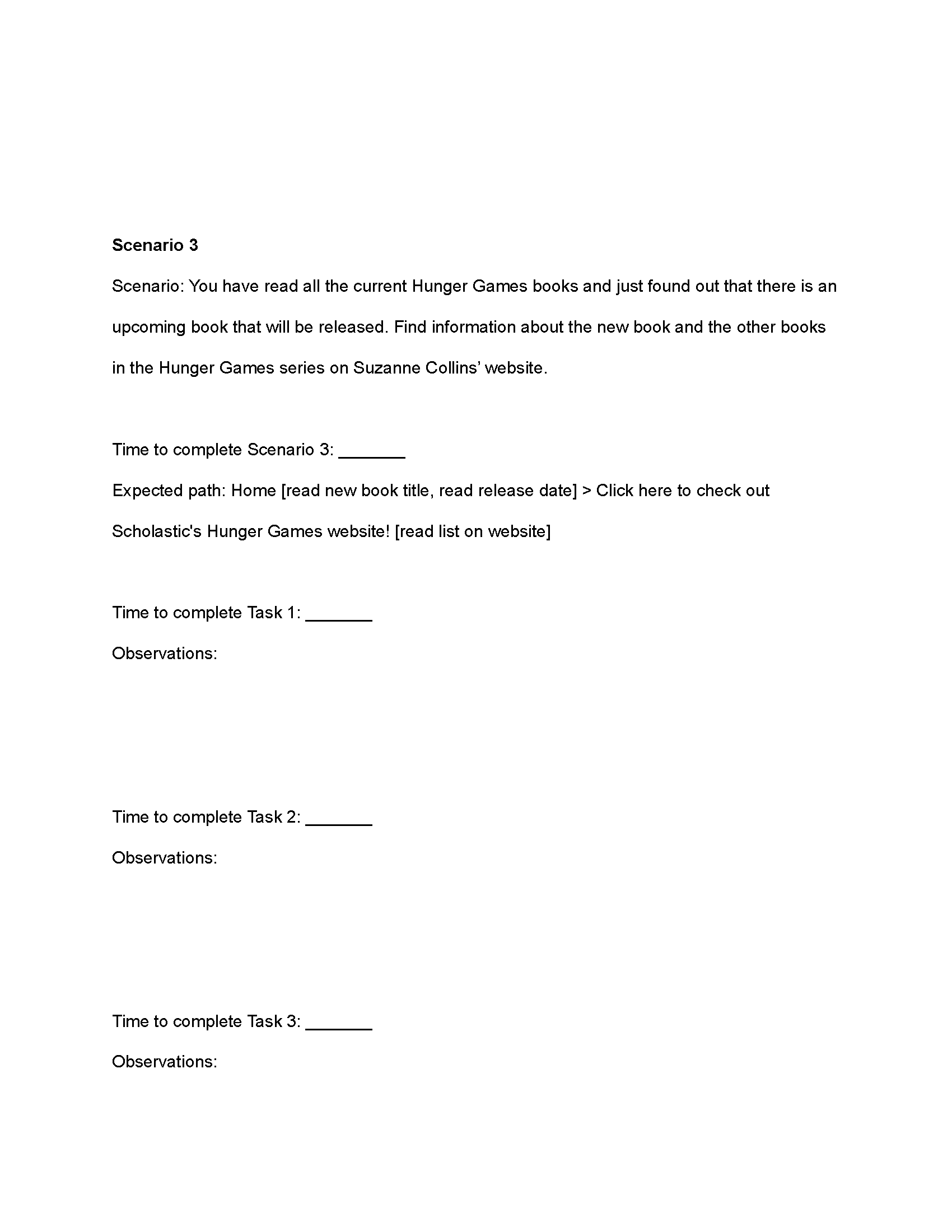
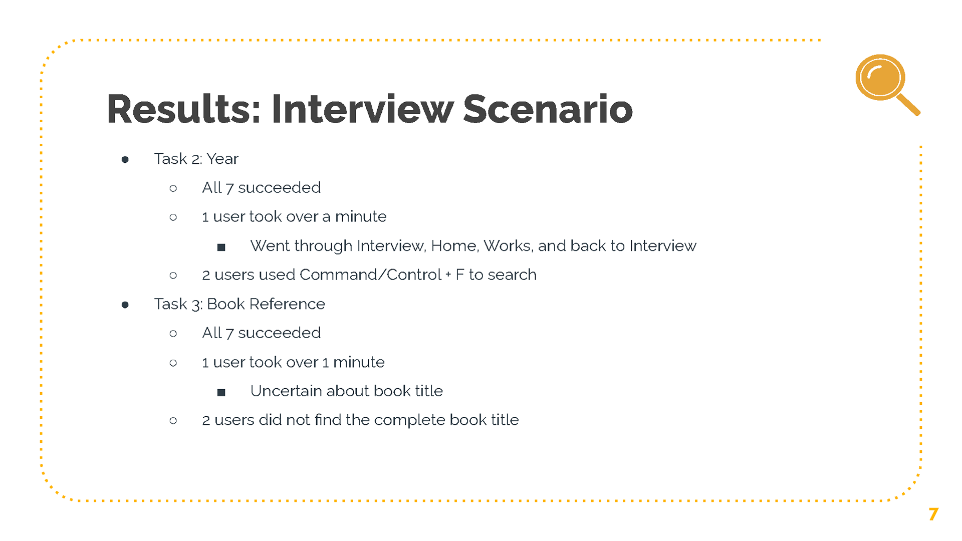
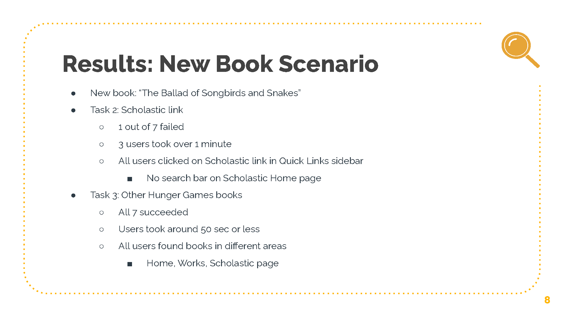
To prep for the user testing sessions, the team developed two documents. One of the documents had a post-test questionnaire, a list of 3 scenarios with 3 tasks each, and a post-test questionnaire. The post-test questionnaire is used to get information about the user and their familiarity with Suzanne Collins and her books, similarly to the user research survey. The post-test questionnaire gathers feedback on the overall experience, thoughts, and opinions that the user had during their session. The scenarios were written to provide the user a situation that they can imagine themself in and from there, they are given 3 tasks where they will navigate the website to accomplish their tasks. These scenarios targets specific critical issues that were found through user research and heuristic evaluations, which were to find specific information about books, where to buy them, and the visual organization of the website.
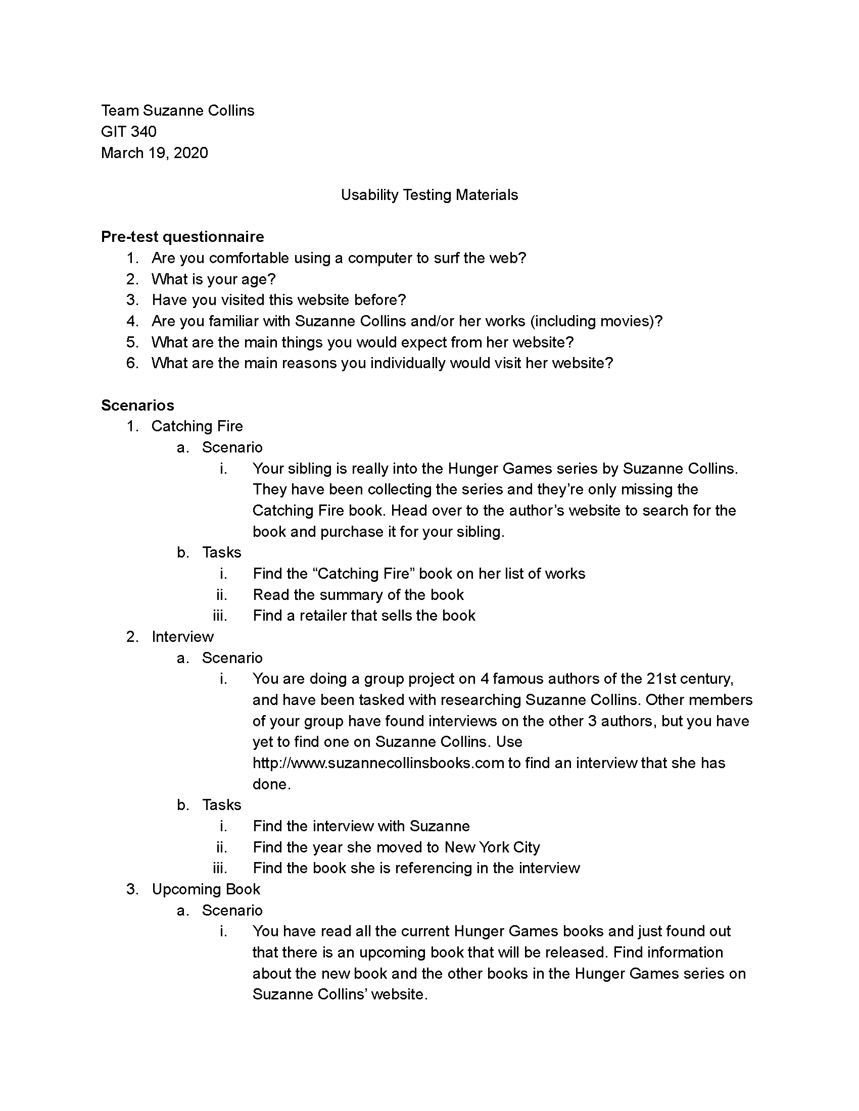
The other document is an observation sheet where the users' expected paths are written for each task, the time it took for each task, whether the user succeeded or failed the task, and any observations found during the session.
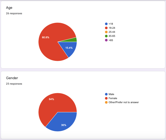
Each team member was assigned to 2 users except for one member who was responsible for only one user, totaling the number of participants to 7. A majority of these users were 18-24 years old and were familiar with Suzanne Collins. For the 2 users I tested the website with, the sessions were held remotely over Zoom through Shared Screen. During the sessions, I wrote detailed observations of the paths the users took, any commentary, facial expressions and/or body language they had that showed indications of the user feeling confused, frustrated, confident, or at ease.
User Testing Data Analysis
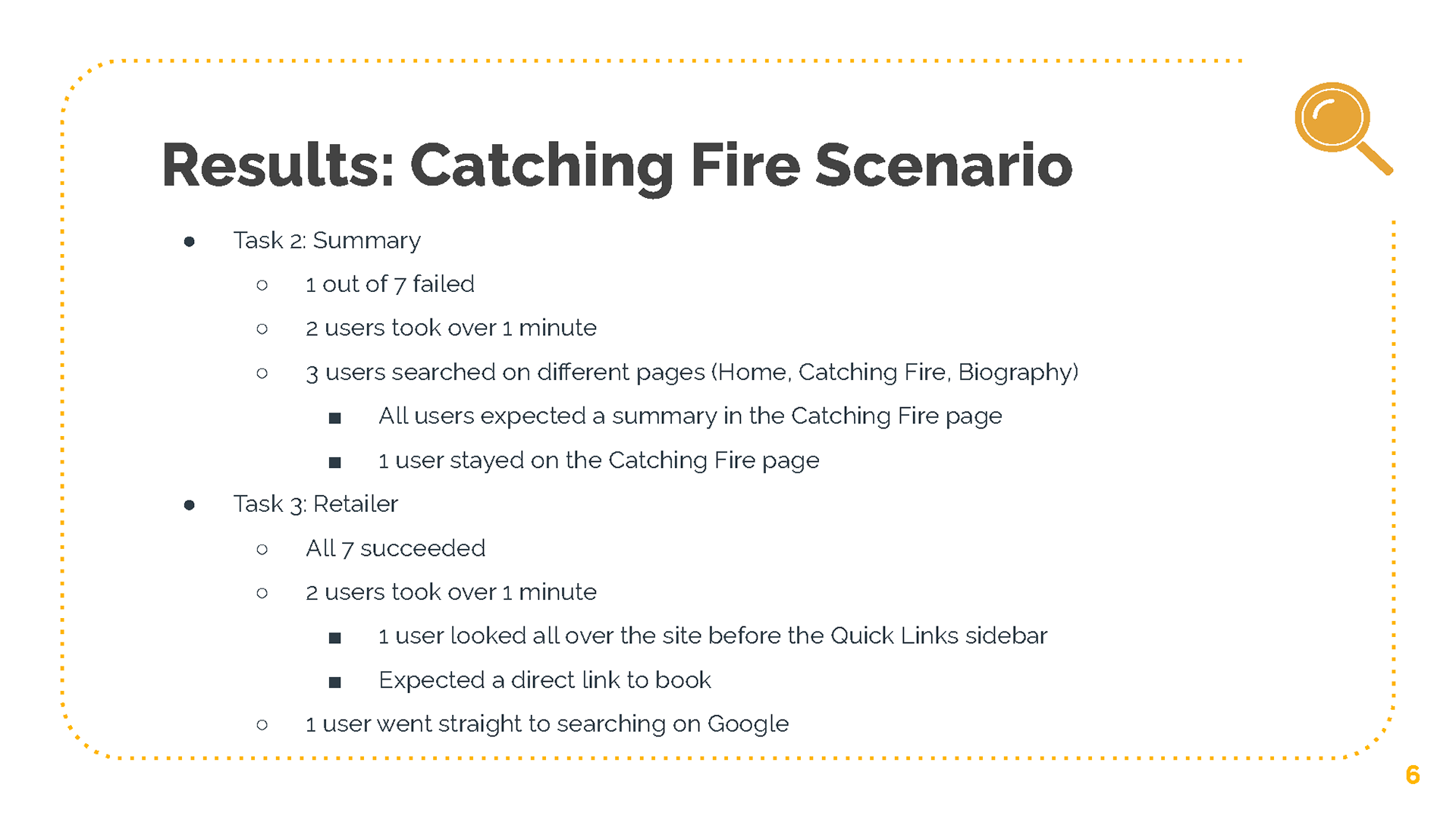
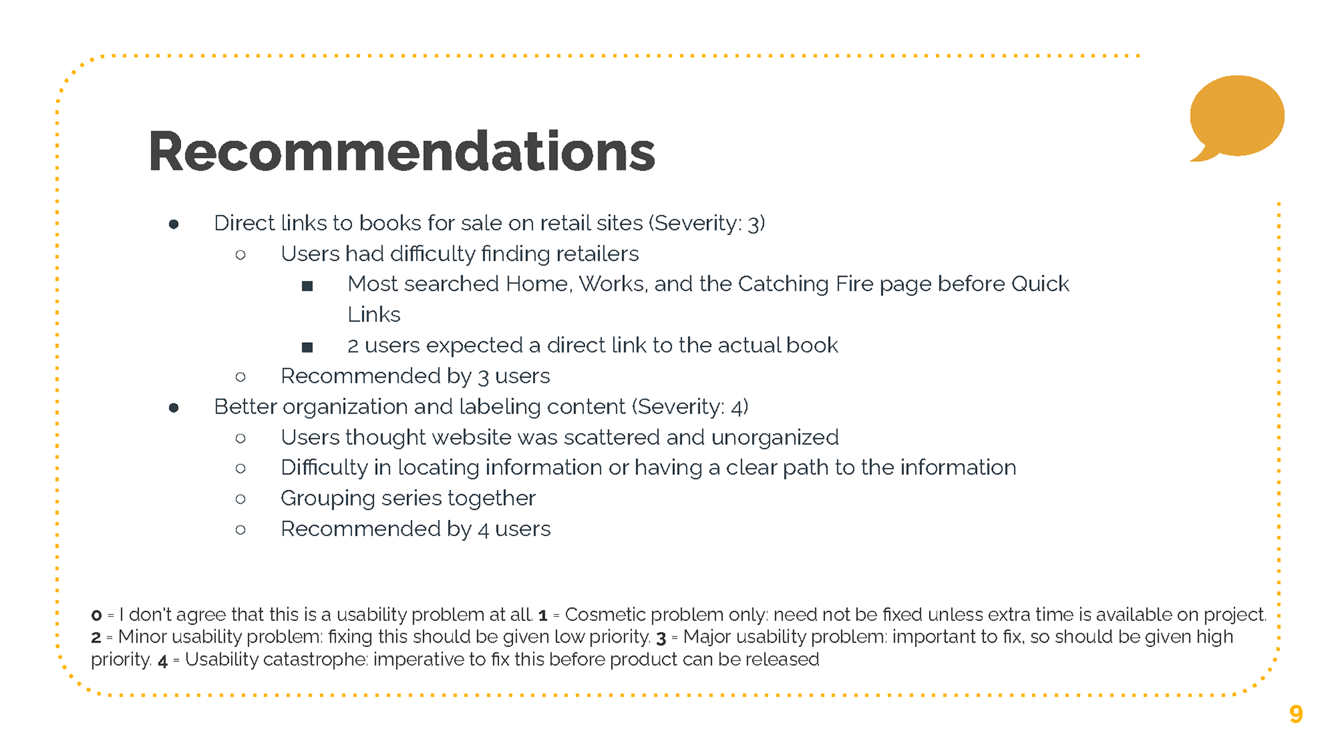
After viewing all team members' data, we found similarities and differences in the way tasks were performed. Some users took a long time to find specific links and information and some took different paths to accomplish the tasks. There were some surprising actions taken by the users that we did not expect such as the users using Command/Control + F to search for information on a page and a user going straight to the Scholastic website to purchase The Ballad of Songbirds and Snakes in which they were unable to find due to the lack of a search bar.
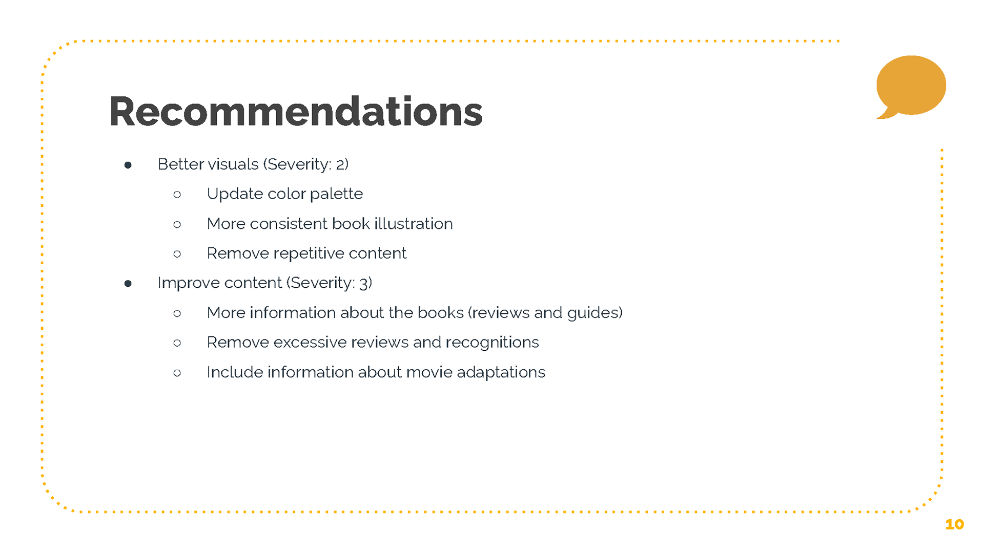
From the data gathered and the recommendations provided by the users, it is agreed upon that the website needed direct retailer links to purchase books, better organization with labeled content, better visual design, and an improvement in content.
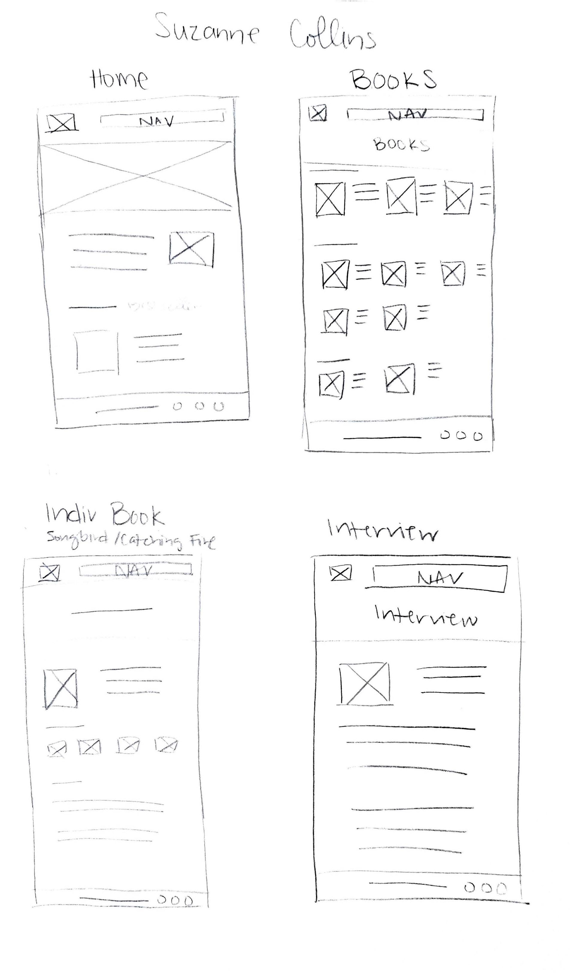
Website Redesign Low-Fidelity Wireframes
Website Redesign High-Fidelity Wireframes
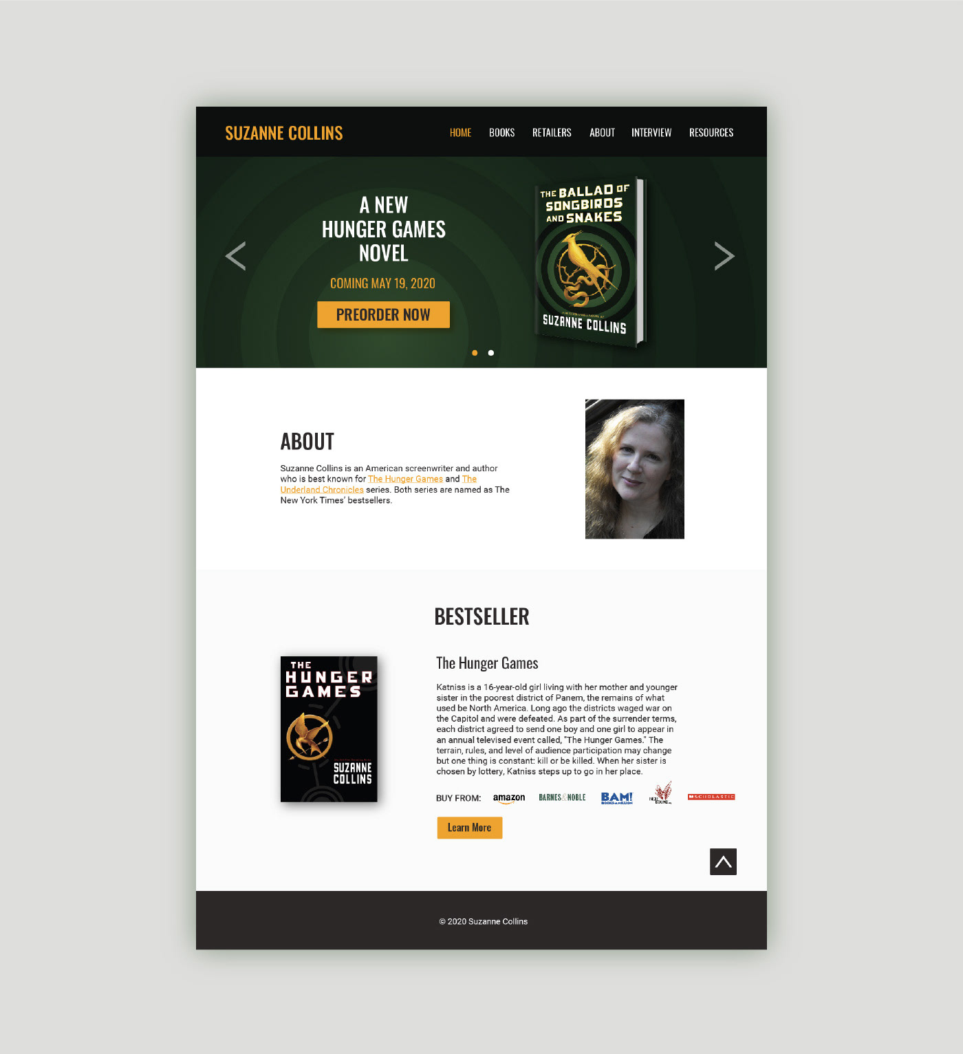
Based on the data results, observations, and recommendations, I concluded that the website needed to be organized with proper labels on a grid layout to provide a clear path for users to easily navigate the website. Color schemes were chosen to be high contrast and gave off the feel of Suzanne Collins' books, specifically The Hunger Games as it best reflected the genres of her recent works which were dark and fantasy. Typefaces were kept to 2 with some style variations. To differentiate headings and subheadings, uppercase letters, font size, and color were utilized. Links were either underlined or buttons.
Majority of the navigation links that were finalized from the card sorting activity were kept the same, except for the categories for the books. If Collins decided to write another series or genre, the navigation would start to overcrowd. As a result, I placed the categories under the navigation link, Books, and separated them by sections. Where to Buy was renamed to Retailers as it was more intuitive and was suggested by a user.
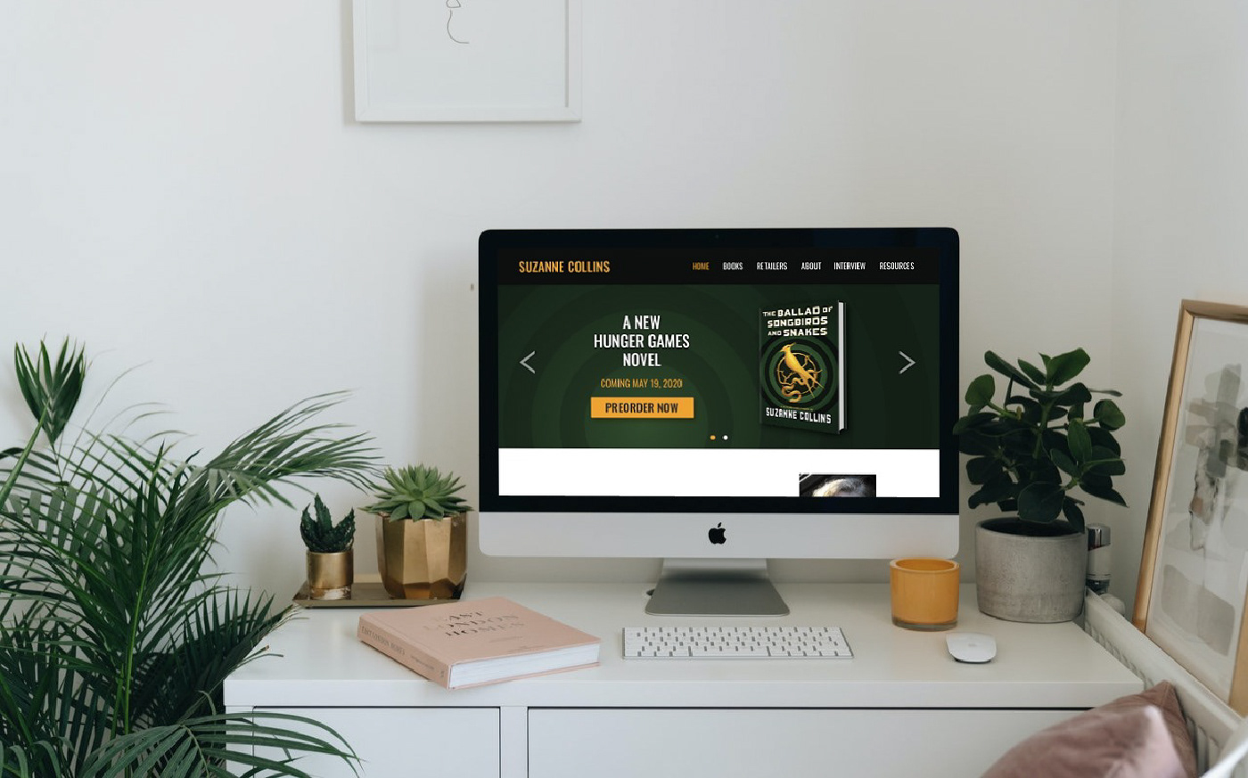
On the Home page, a slideshow is used as the hero image to inform users of any relevant news such as an upcoming book or movie adaption. The welcome blurb was also rewritten to be less ambiguous and provided more information on what the website is and what it has to offer.
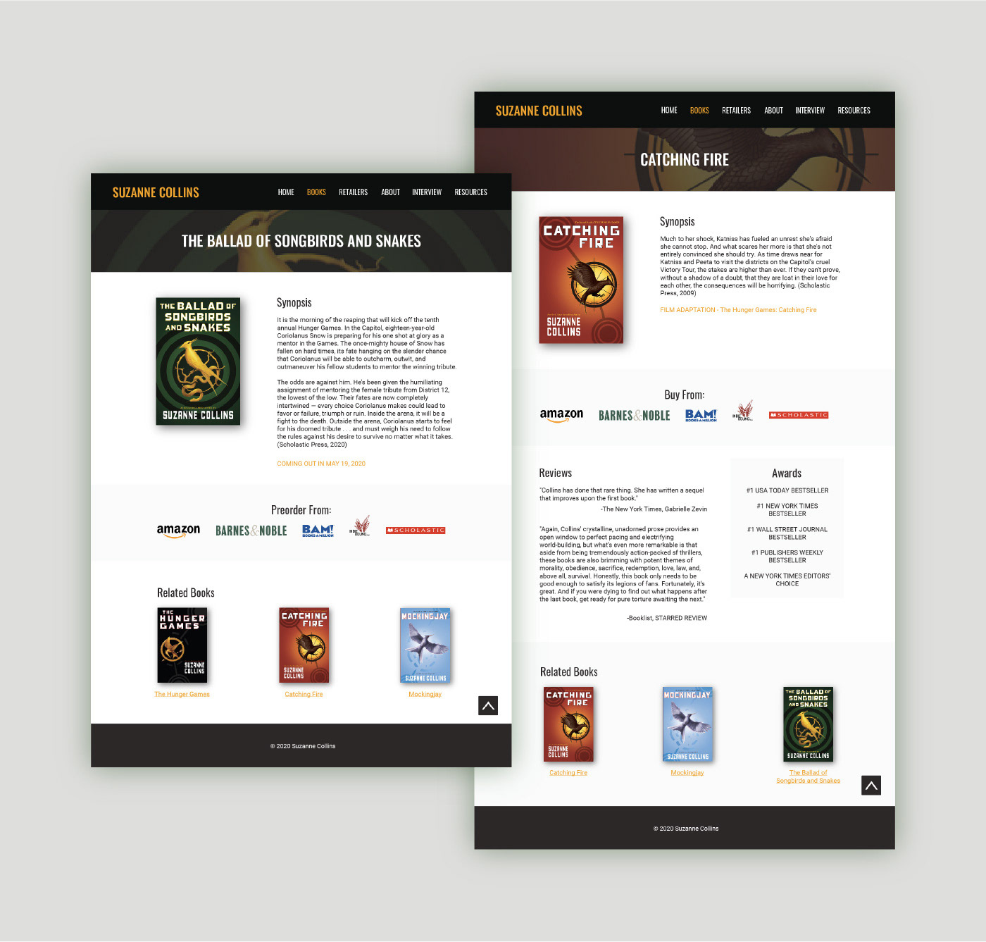
For the Books page, the books are organized by series in chronological order with summaries and direct links to retailers for quick access. A filter dropdown menu was added to help jump to a specific series as scrolling through a large number of books can be exhausting. The individual pages for the books included retailers, summaries, and a small amount of reviews and awards/recognitions.
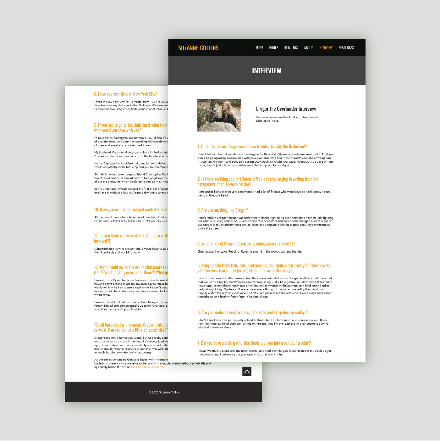
The Interview page needed more clarity on what the interview was referencing to. As a result, Gregor the Overlander was added to the subheading. Content was organized in a clear visual hierarchy using typefaces and colors to differentiate between questions and answers.